
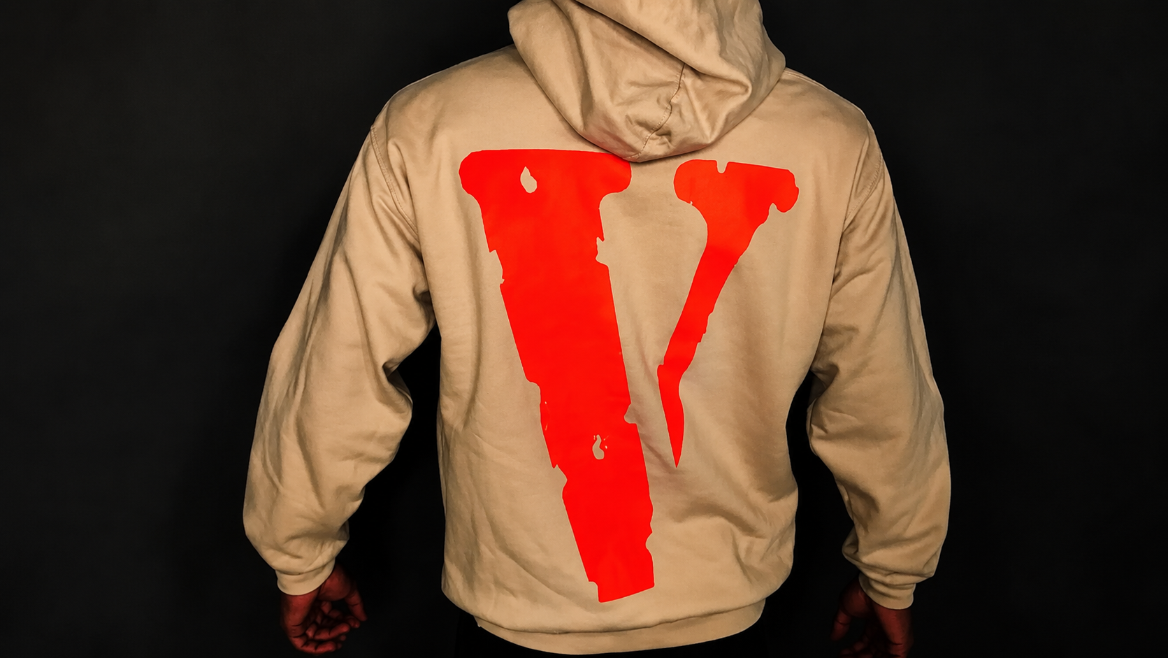
Bright orange, bold, and instantly recognizable — the Vlone “V” has become one of the most identifiable logos in modern streetwear. But like the brand’s name itself, the logo carries more intention behind it than most fans realize at first glance.
A Simple Symbol With a Direct Message
The “V” logo is a direct visual extension of the brand’s name and philosophy. Where the name “Vlone” reworks “alone” into a statement about individuality, the logo does the same job visually — a single, bold letter designed to stand entirely on its own, without needing extra graphics, taglines, or explanation to be recognized. That simplicity was deliberate. A logo built around standing alone needed to visually represent exactly that.
Why Orange?
The bright, high-visibility orange used across most Vlone branding wasn’t chosen by accident. The color is loud, impossible to miss, and stands out sharply against nearly any background — reinforcing the same “impossible to ignore” energy the brand built its identity around. It also gave Vlone instant shelf and street recognition; even from a distance, the orange “V” reads as unmistakably Vlone before anyone can make out any other detail on the garment.
Consistency Across Collaborations
One of the more interesting aspects of the logo’s history is how consistently it’s stayed central across Vlone’s many collaborations — with Juice WRLD, Pop Smoke, Off-White, Fragment Design, and others. Rather than being replaced or overshadowed by a collaborator’s own branding, the “V” has typically remained part of the design, sometimes reworked in a collaborator’s color palette but rarely removed entirely. That consistency has helped keep the logo recognizable even as the brand’s roster of partnerships has grown.
A Logo That Became a Cultural Marker
Beyond fashion, the “V” logo took on a life of its own within hip-hop culture, frequently appearing in music videos, on-stage performances, and social media well beyond the brand’s direct marketing. That organic visibility — driven by fans and artists rather than paid placement — is part of why the logo carries as much recognition today as some far older, more established streetwear marks.
Why the Logo Still Matters
Despite changes in the brand’s leadership and ownership over the years, the “V” logo has remained the one constant thread tying every era of Vlone together. It’s arguably a stronger piece of the brand’s identity than any single release or collaboration — a symbol that still communicates the same message of individuality it was designed around from the very beginning.
Explore the Collection
See the logo across the current lineup — browse Vlone Hoodies and Vlone T-Shirts, or read what the Vlone name actually means to understand the full story behind the brand’s identity.